UIC RIDE
Improving Access and Experience
Problem Statement
During my time at UIC, I identified opportunities to improve policy clarity and accessibility in the UIC Ride app. Inconsistent rider eligibility communication and missing accessible ride options reduced service reliability. I led a redesign focused on clarity, consistency, and inclusive access.
What is this app all about??
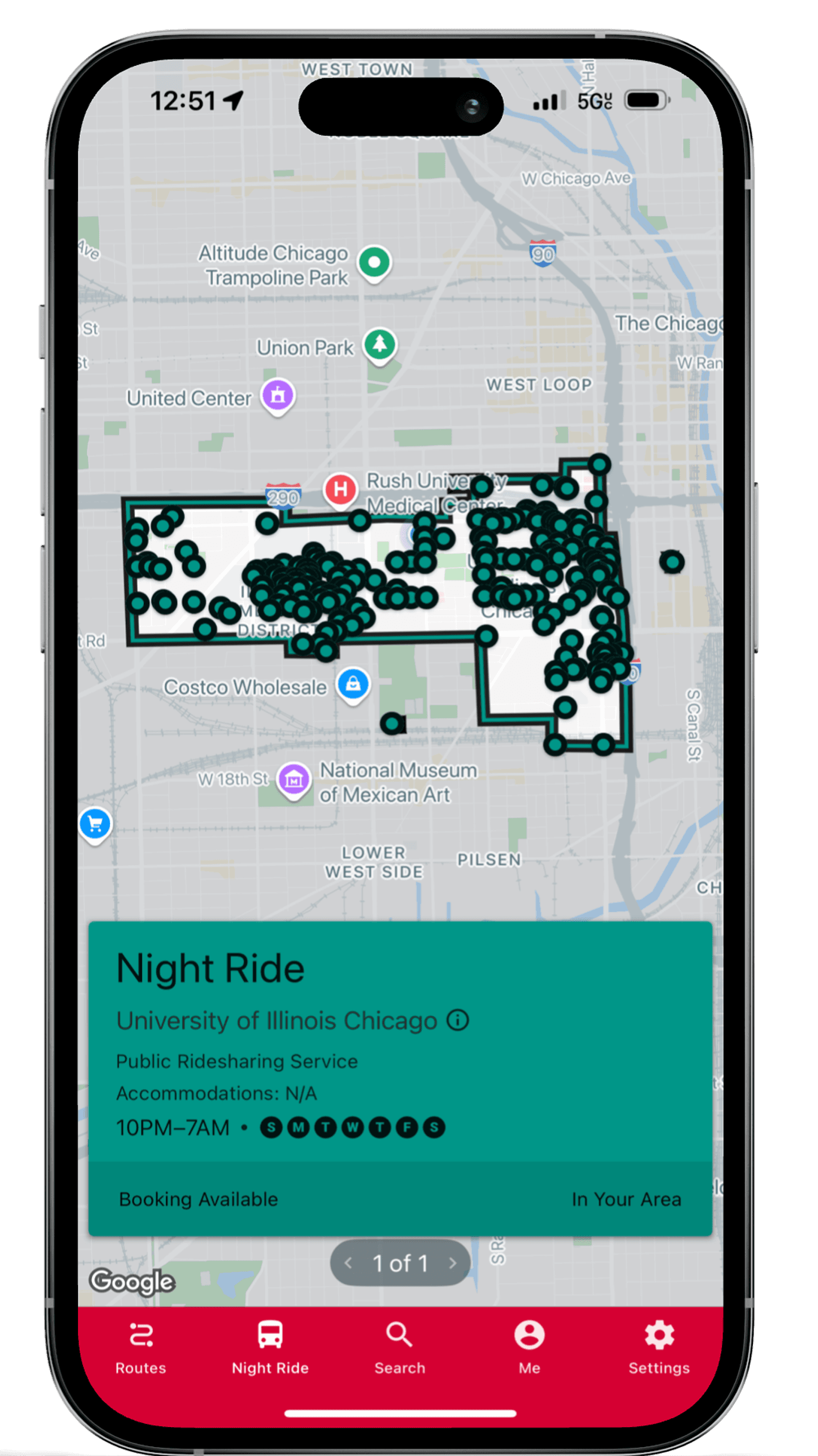
It is a Ride service offered by the University of Illinois at Chicago to all it’s students and staff.

Best Practices of the app
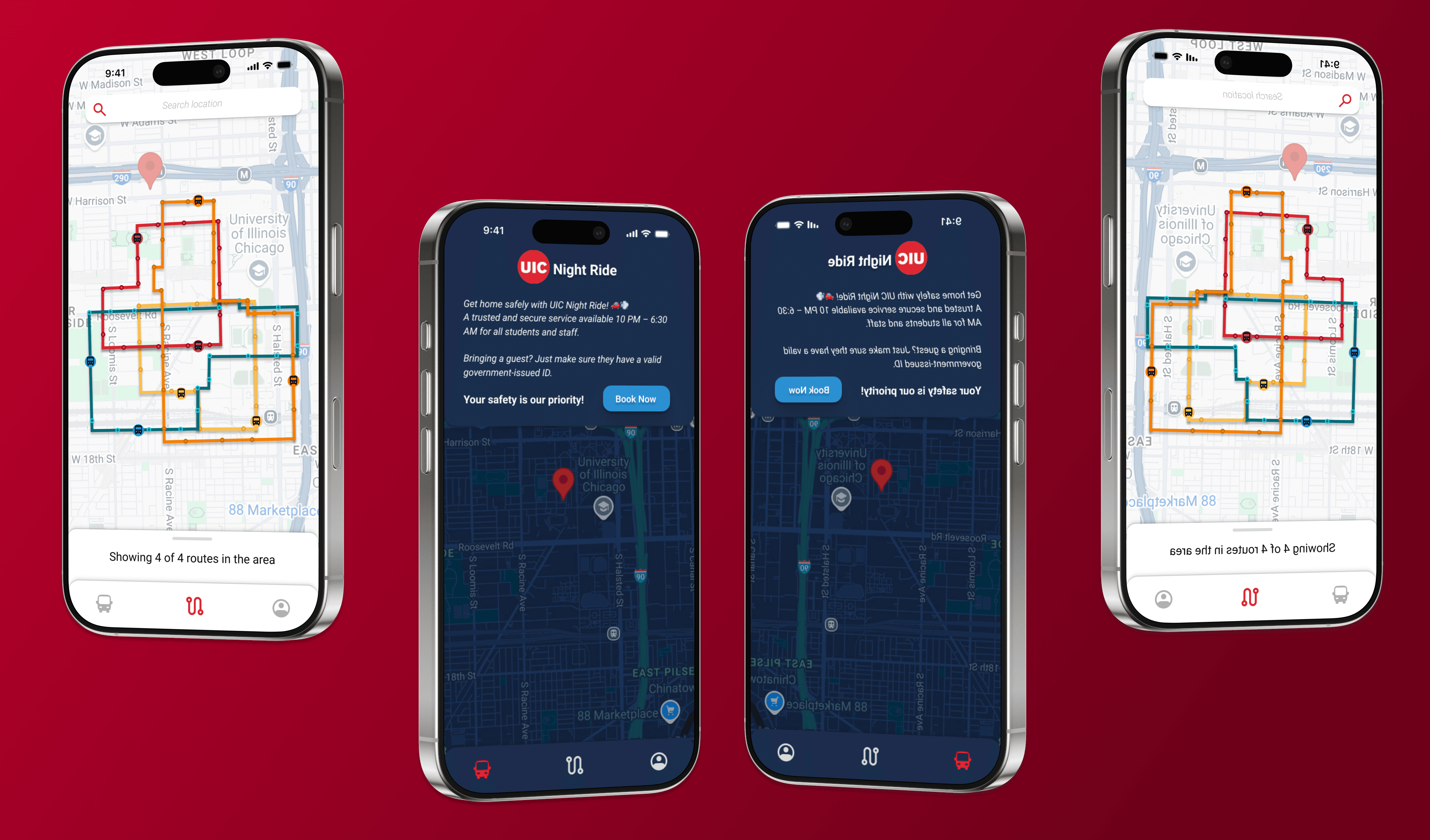
Login with your UIC SSO to access the app.
Book night ride service for yourself only.
Swipe student ID for shuttle services.
Check your schedules and book ahead.
Solution
Before and After Redesigning

From 5 Flows to 3 Flows
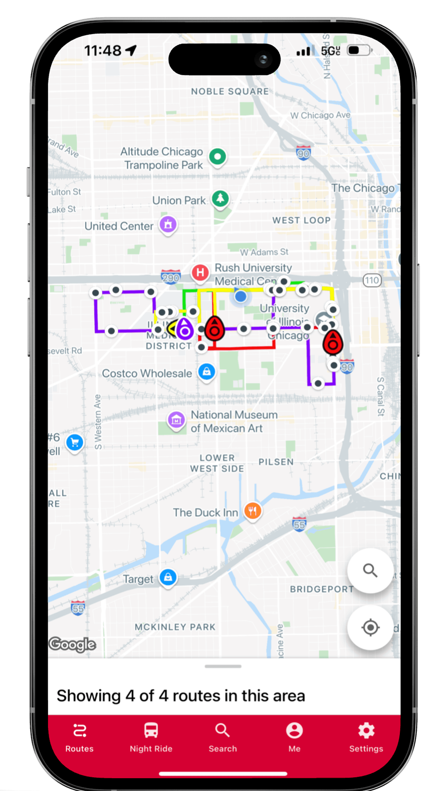
Removed the in-app maps feature after learning that over 90% of users never used it and found it confusing. Streamlining the interface improves clarity and focuses on core functionality.
Every feature now has clear ownership — making UIC not just a provider, but an accountable facilitator of safe, accessible campus mobility
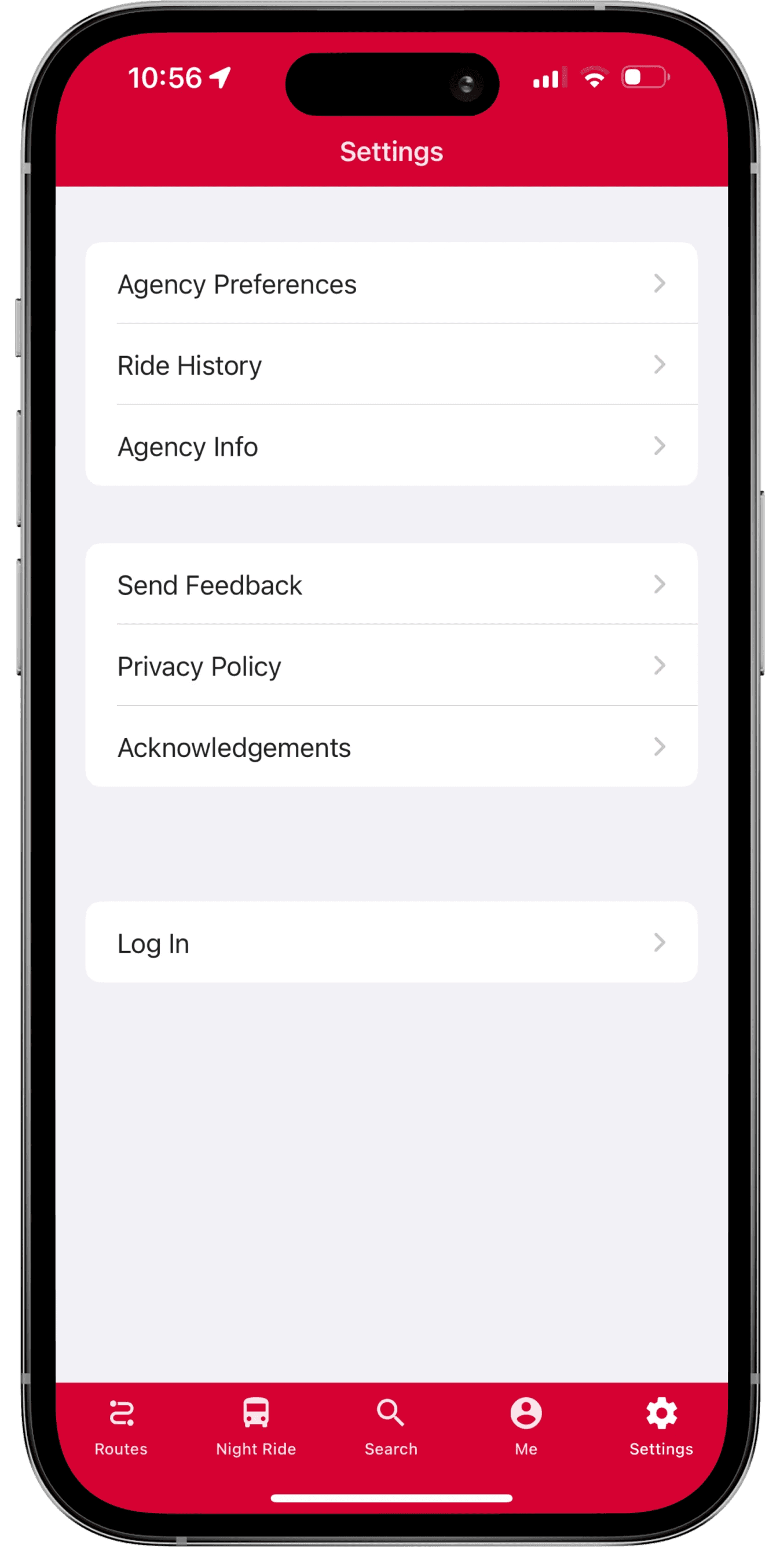
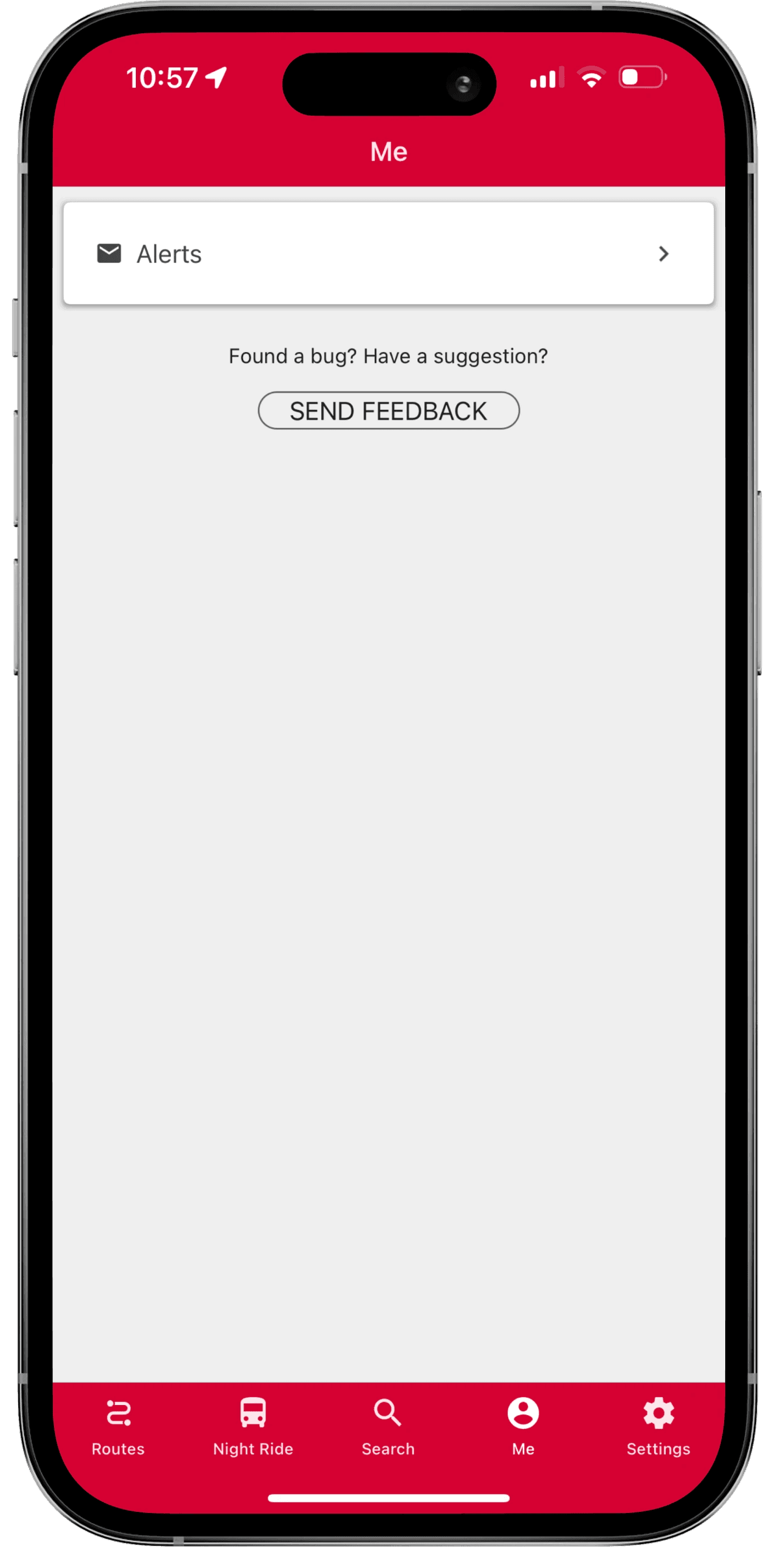
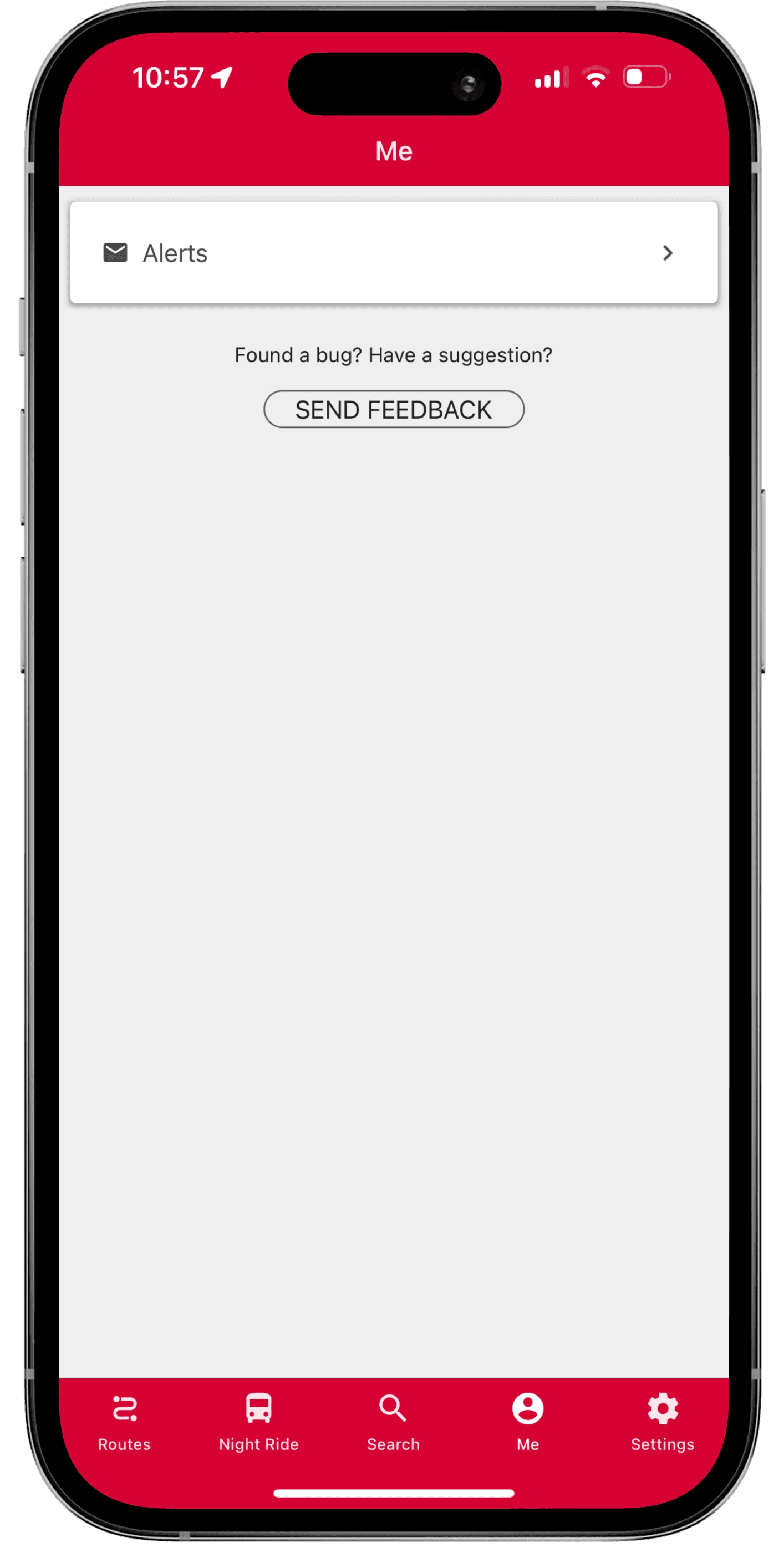
Clutter to organized Flow - “Account”
I removed the “Alerts” button since users already receive notifications via push alerts, and also eliminated the “Send Feedback” option which is available under Settings—simplifying the interface.


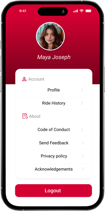
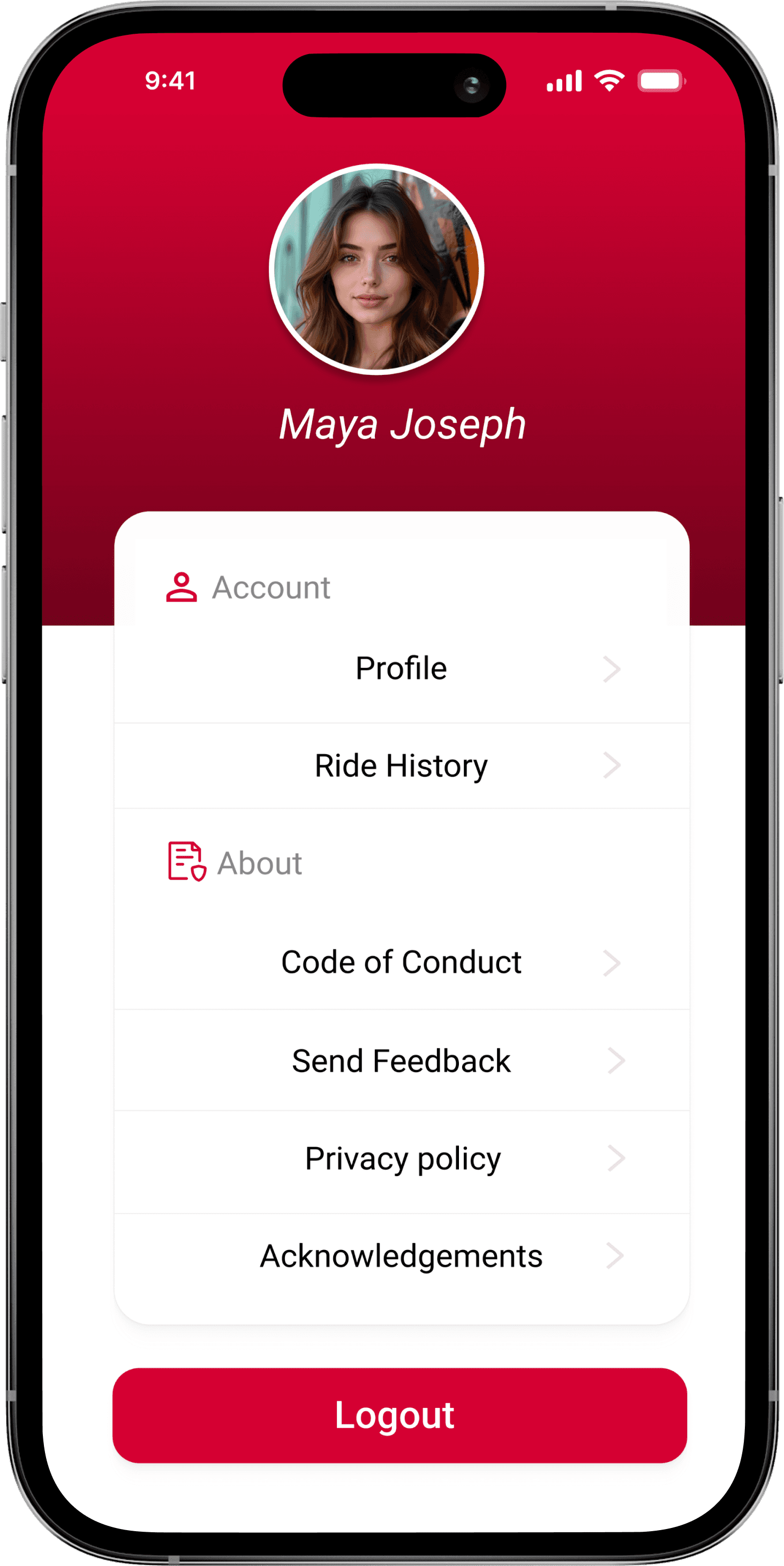
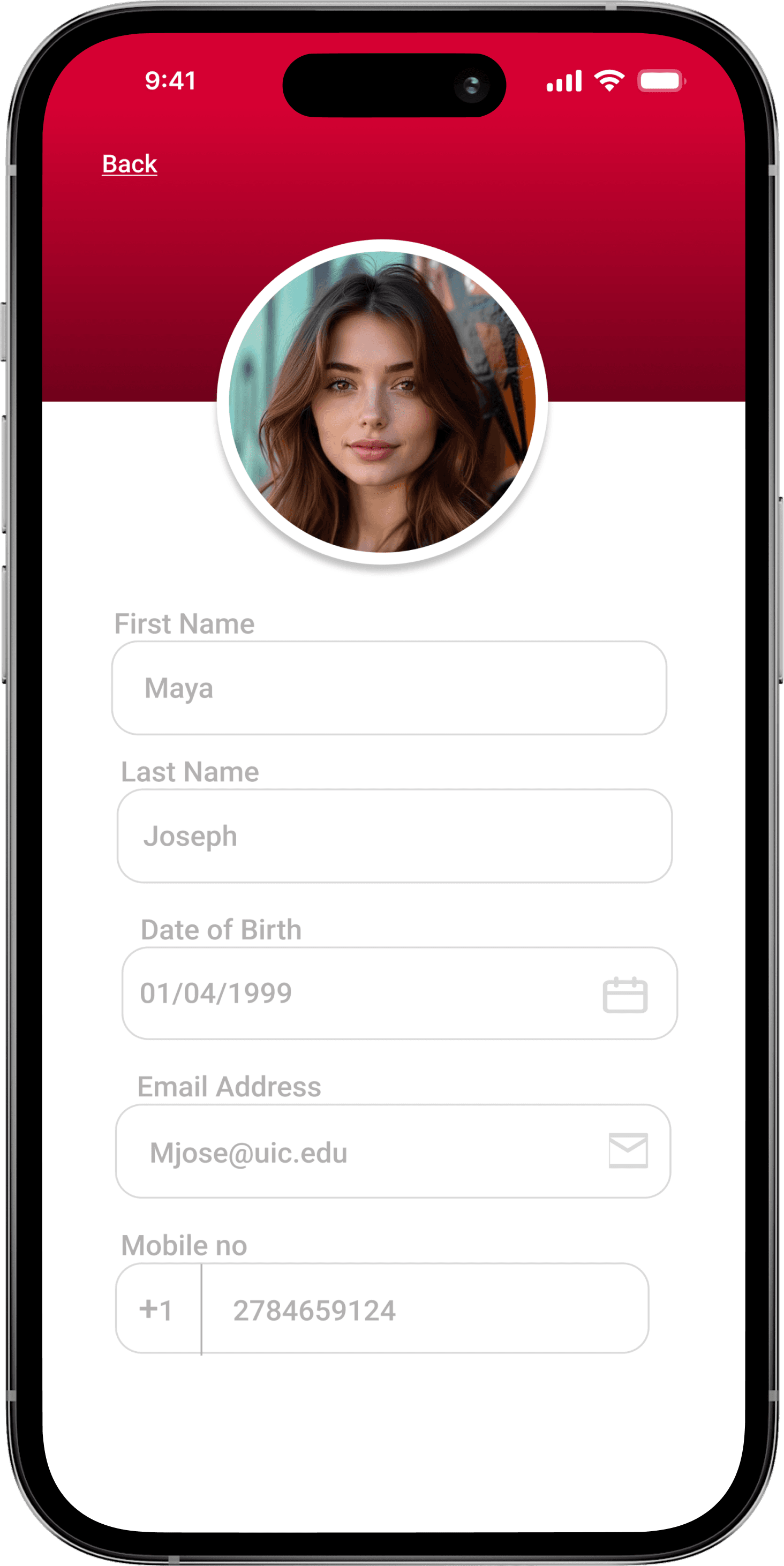
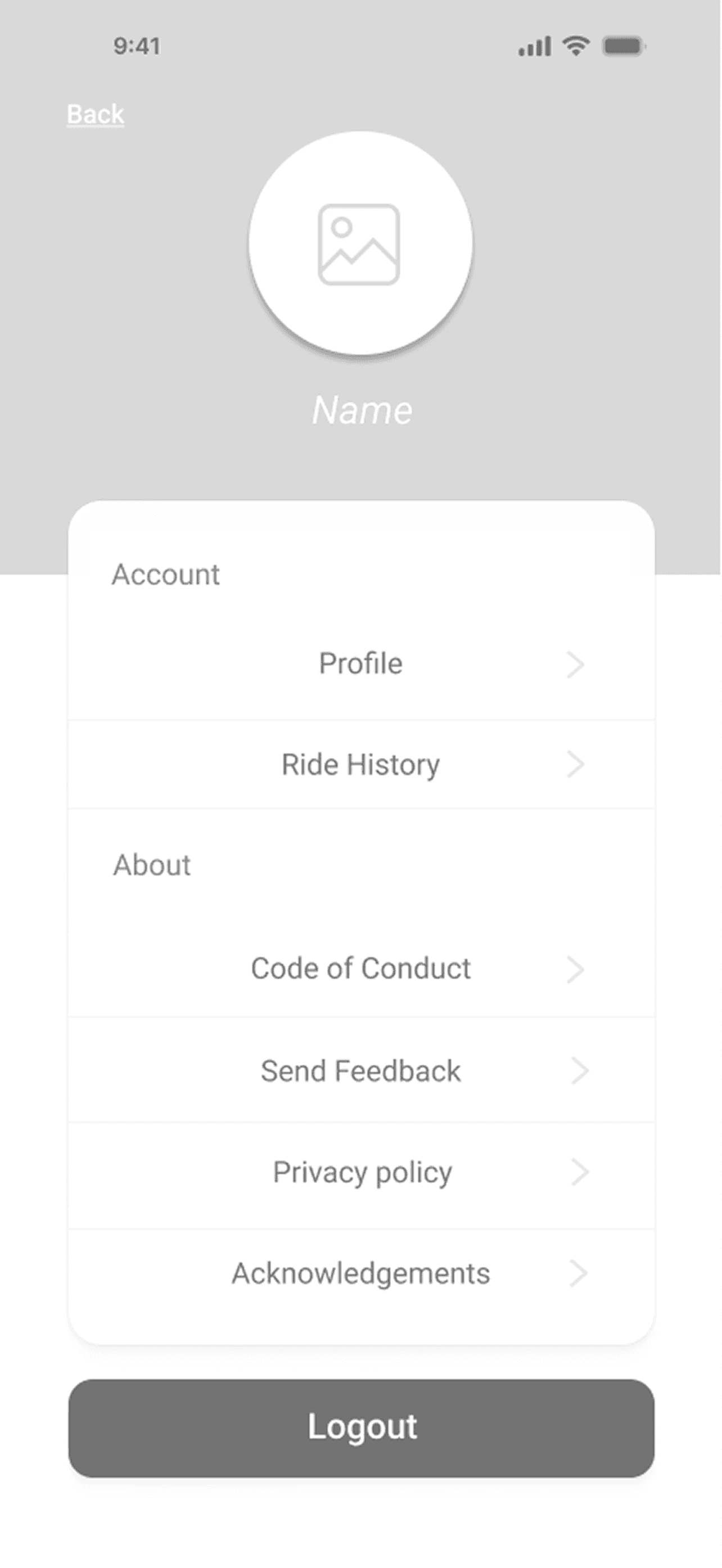
Added a View-only Profile section
I added a new Profile section showing non-editable user info (name, email, phone number, age, and profile picture) pulled from SSO.
This increases transparency about what data the app uses and helps users verify their identity when interacting with drivers.


Booking & Accessibility Enhancements

User Interviews
Sample Size
The research consisted of 10 participants and was conducted through in-depth, one-on-one interviews with students.
The Agenda
The user interview was conducted in three Phases to understand their experiences, to understand what worked and what did not and to gather suggestions for improvement.
Needs & Challenges
Clarity, consistency, and accessibility emerged as the most critical needs for users to trust and effectively use the UIC Ride app.
Phase 1 Goal: Understand familiarity, context, expectations.
Sample Questions - Walk me through how you usually use the UIC Ride app. | When you open it, what’s the first thing you do? | Is there anything that’s confusing or could be clearer for you?
Phase 2 Goal: Gather real stories and emotional responses.
Sample Questions - Can you share a time the UIC Ride app worked well for you? Have you had any frustrating or unexpected experiences? What happened? How clear and supportive did the process feel during that experience?
Phase 3 Goal: Observe reactions and gather improvement ideas.
Sample Questions - Can you show me how you’d book a ride? What do you notice in the app? Anything confusing or unnecessary? If you could change one thing, what would it be and why?
User Dialogues = Identifying Gaps
"The app looks okay, but the colors are bad."
Initial Design - Testing and Improvements
3 Key Improvements.
Based on feedback from five survey participants and two mentors, I iterated on the design at two stages, after low fidelity wireframes and the initial high fidelity light mode design. Over six weeks, changes focused on improving usability and better aligning with user needs.
Prioritizing Core Usage Over Unused Features
Initial Idea: Planned to retain the Maps feature and merge account and settings to reduce clutter.
Change Made: Removed the Maps feature based on feedback, as it was rarely used and caused confusion.
Impact: The home screen now starts with the Shuttle Service, aligning better with student routines and simplifying the user experience.
Before
After

Decluttering the Account Flow’ for Better Navigation
Initial Idea: The original design combined all options—account details, settings, and agency information—into a single section to keep things centralized.
Change Made: In the final iteration, I reorganized the content into two clear sections: Account and About, and removed the agency info, since it’s obvious the service is run by UIC Shuttle and Night Ride.
Impact: The profile is now cleaner and more intuitive, helping users quickly find what they need without unnecessary information.
Before

After
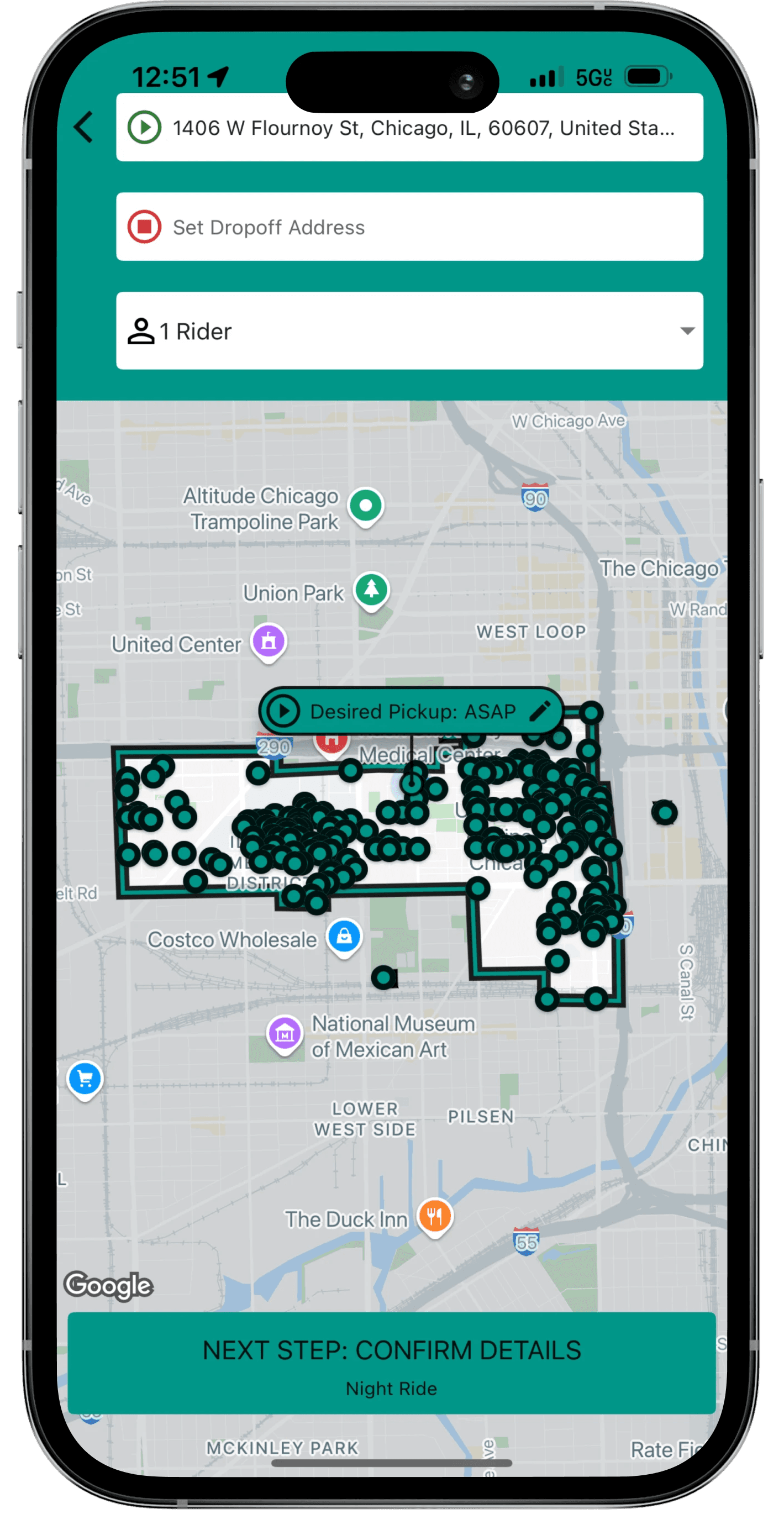
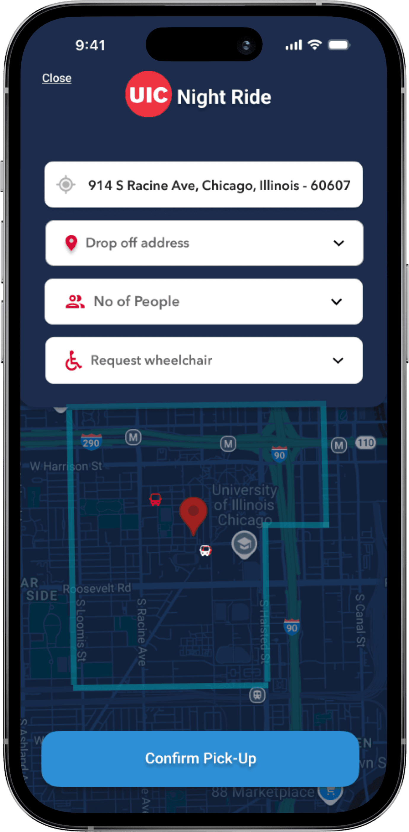
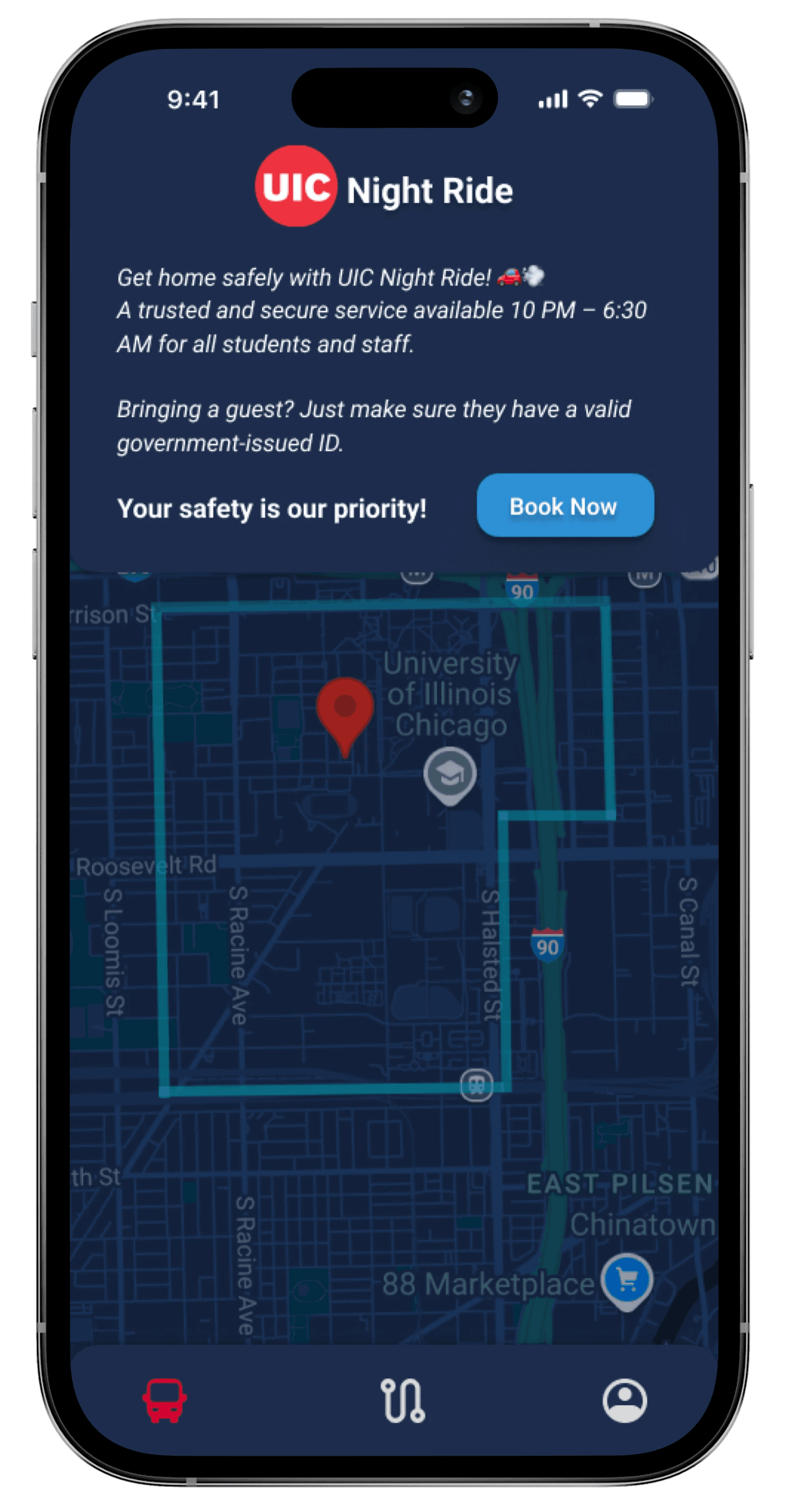
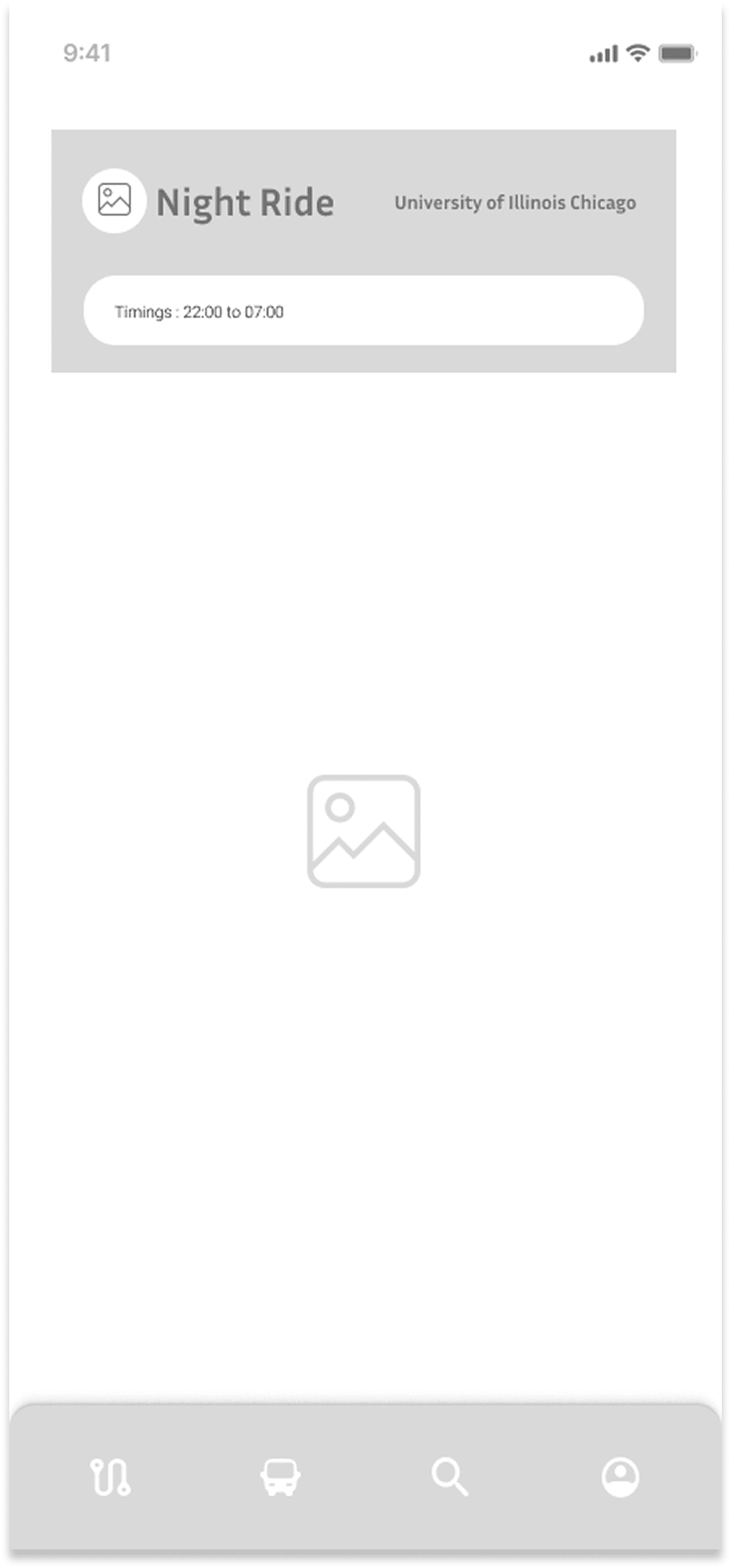
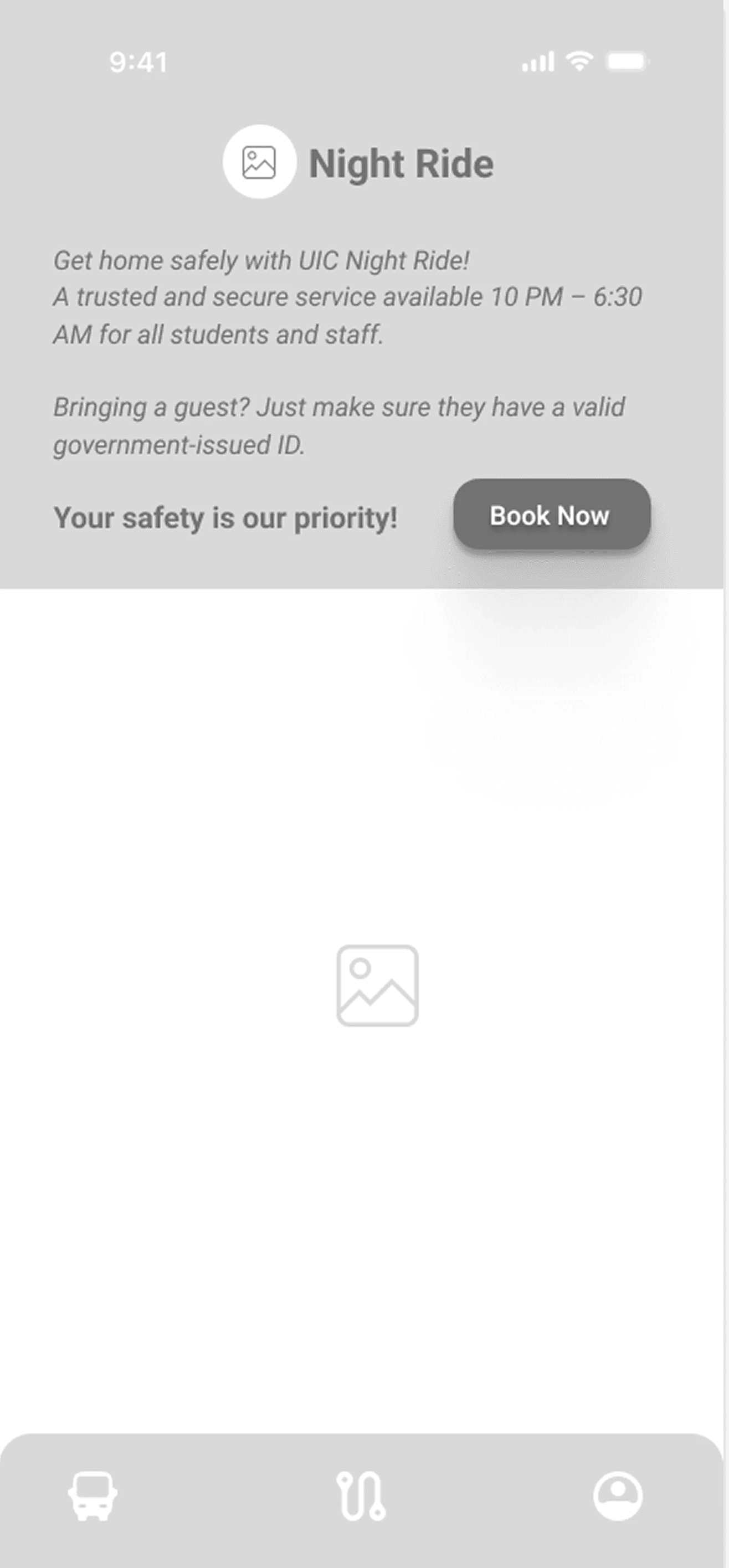
From “Is This Clickable?” to “Book Now”
Initial Idea: The original design had a large, unclear button showing timings and days, making booking feel intuitive but not direct.
Change Made: I added a guest policy message and replaced it with a clear “Book Now” CTA.
Impact: The flow is now clearer and more accessible, with reduced confusion around booking and guest limits.


FInal Design
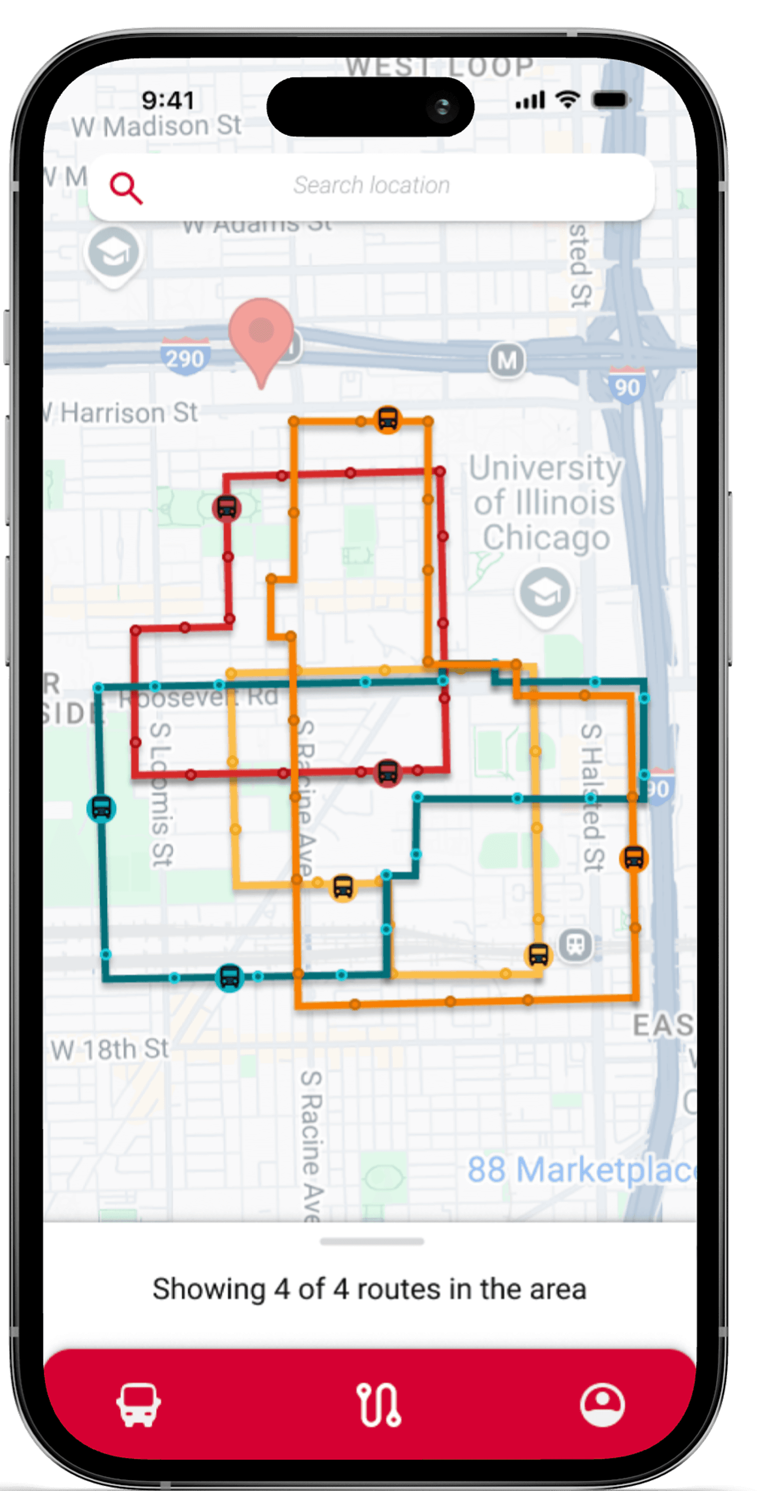
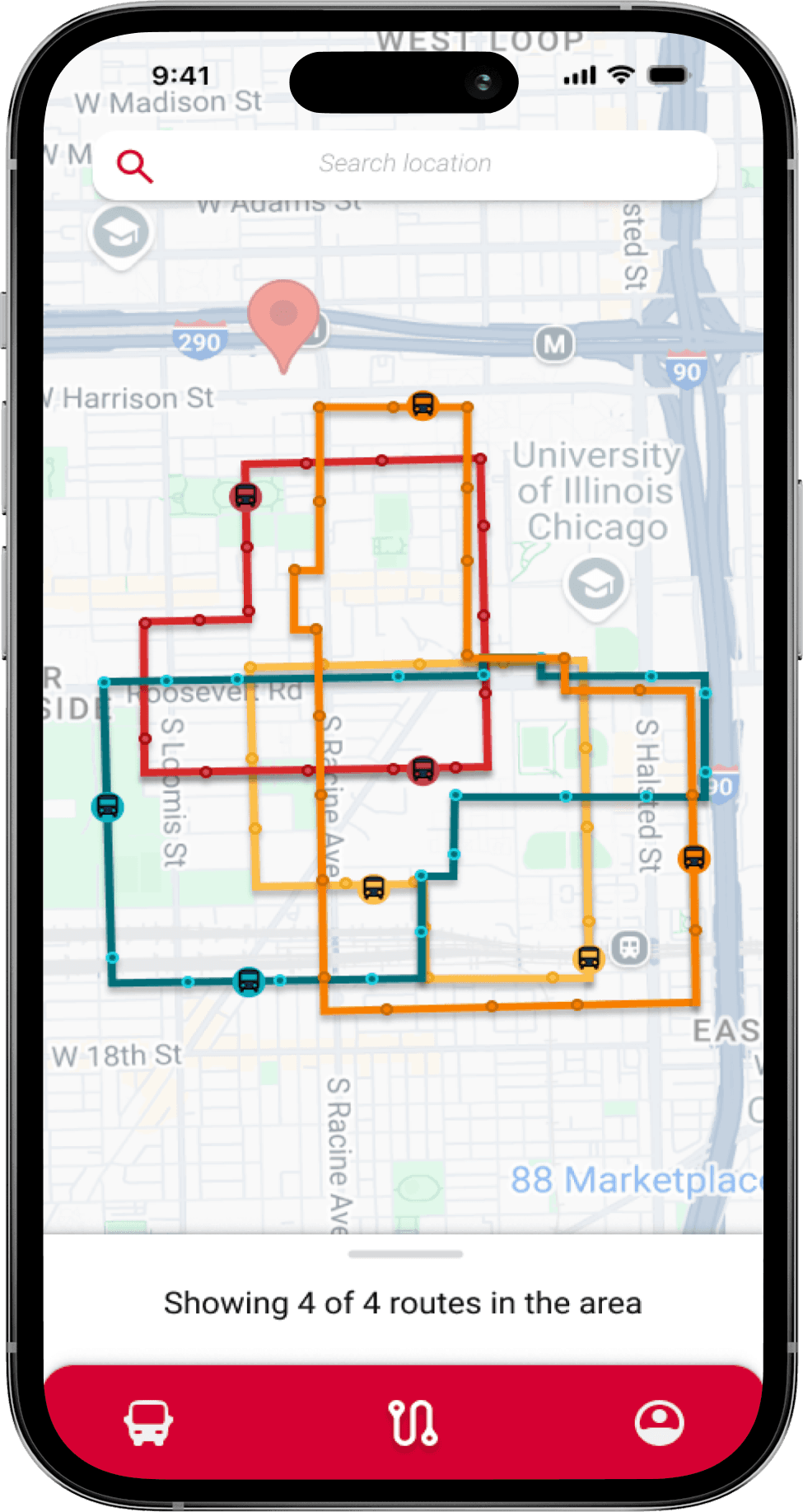
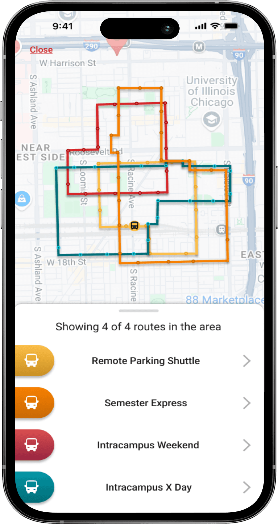
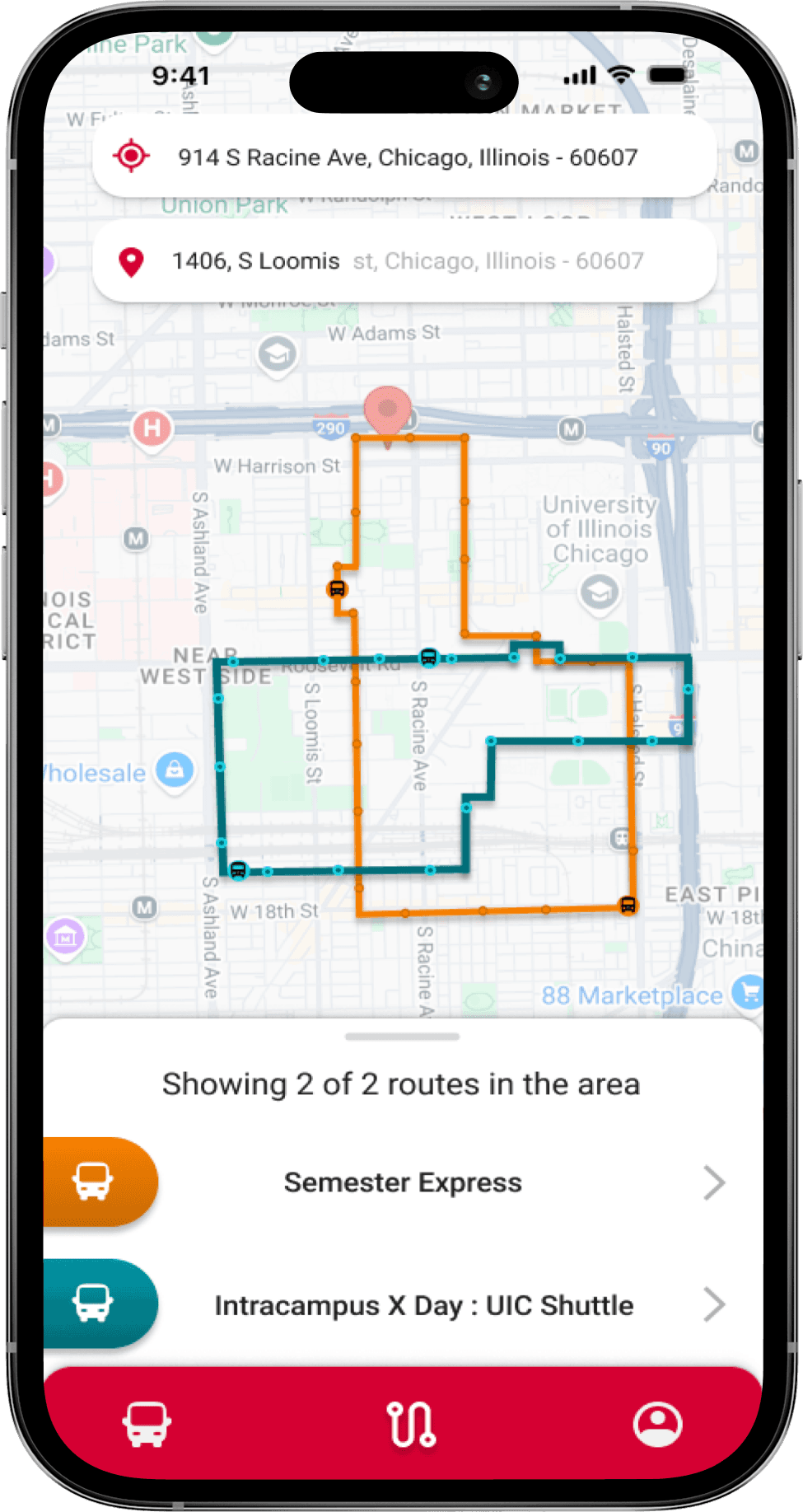
UIC Shuttle


Screen 1
Screen 2
Screen 3
Screen 4
Screen 5

Screen 6

Screen 1

Screen 2
Screen 3

Screen 4

Screen 5

Screen 6
